IN SEARCH OF THE RARE AND WONDERFUL

Join me on the search for virtuosity in fashion, interior design and decorative objects, and experience their discovery with me. Just call me Appreciator-in-Chief!

Friday, August 14, 2015

The Gilded Lily Observed: A Rare Glimpse Into Private Worlds

The Portraits of Interiors of Walter Gay and Isabelle Rey

The very rich are very different from you and me, to expand on the familiar phrase.

That difference, enormous wealth, has enabled individuals possessing it to support the arts, and artists, for their own pleasure and for the envy of the world around them.

Emblems of their taste, power, social standing and lifestyle attest to the patronage of this class in every culture, in paintings, statuary, jewelry and bejeweled artifacts, interiors, and architectural wonders - home to them, Versailles to the rest of us.  

Every aspect of life is an opportunity to reveal their taste and to project their status lest someone miss the point.

No indulgence is out of bounds, every lily gilded, legions of handlers at the ready to address their every whim.

Two individuals, Walter Gay and Isabelle Rey, have something in common with this privileged group in a most unique way: they have had access to every room in many of their homes, but not as “servants”.

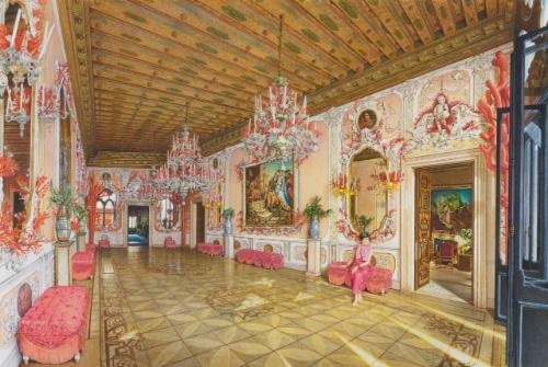
Both are renowned water colorists specializing in portraits of interiors, in a long tradition of recording the taste of the wealthy, two artists painting in different styles a hundred years apart.

Fortunate in their connections, in the form of Gay’s social circle of the Gilded Age of the 19th century, and Rey being referred to her clients by the pre-eminent French interior decorator of the late 20th century, they have enjoyed patronage and support on a scale that few artists have ever experienced.

I became enamored of them both through different circumstances.

Earlier in my life, while reading the February,1990 issue of Connaissance des Arts, I came across an article about Isabelle Rey.  I was in delighted shock as I read the article and discovered her exquisitely rendered watercolors of Yves St. Laurent and Pierre Berge interiors in Normandy and Marrakech. Breathtaking detail met my eye in photo after photo. Words can hardly describe my feelings upon finding her work.

My dear friend Shawn, familiar with my tastes and interests, several years ago recommended that I acquaint myself with the work of Walter Gay, leading to my doing just that. This was certainly an exciting find for me, to be introduced to Gay’s effortless mastery and impressionistic approach to gorgeous period interiors. Right up my alley.

Therefore, upon discovering Walter Gay, I was able to compare his very different approach to the same task, leading to my desire to bring their respective styles to an audience who might not be aware of their efforts as practitioners of a very precise art form.  

While photography presents an obvious modern option, paintings of elaborately decorated rooms have a certain cachet that very few can afford to underwrite, and, as a tradition of this class for hundreds of years, predate that technology in any case. Thus, its appeal to the highest echelons of society, no matter the time period. There is a genuine rarity to these portraits, as only the very wealthiest would ever have commissioned them.

The perception of grandeur and exclusivity must be preserved at all costs.

Gay’s interiors are slightly dreamy, mirroring the times, painted at the behest of Elsie de Wolfe, Edith Wharton, Henry Clay Frick and their set, recording the interiors of the late 19th and early 20th centuries in all of their splendor, in a style admired by the cognoscenti of the era.

Conversely, but no less beautifully realized, Rey’s interiors are photographic in their minutest detail, rendered exquisitely in painstaking watercolor techniques with just a touch of naivete that lends charm to the finished product, the artist of choice of St. Laurent, Oscar de la Renta, and Dodie Rosekrans, to name just a few of her distinguished clients.

We are thus privy to the taste of modern moguls and the magnificence of design masterpieces in their palazzi and mansions in the most precise and delectable detail, an interesting juxtaposition to the 19th century method of Walter Gay.

As examples of this very specific art form, both artists’ works are a window into a rarefied and closed world, a wonderful record of what only a few could ever imagine, and, through their interpretations, elevation of the tradition to the highest level. How fortunate we are to have their unique viewpoints.

Please enjoy!


Read More

Friday, March 22, 2013

Breath of Fresh Air Department


Miuccia Prada's secondary line, Miu Miu, has scored a bulls-eye by combining quite a few trends into one season, Autumn-Winter 2013.


Black and white is NOT in the mix,


But patterns are, as well as pastels, gigantic pink bags, and Victorian footwear, not to mention polka dots, in coats, dresses, neck-wear and tights.  Stripes have not been left out, to be found on bags and tights.


Pink, baby blue and yellow are juxtaposed with navy and white, and black and yellow with red touches.


Refreshing?  Absolutely!


Charming, whimsical, wearable, wantable.

See what you think!!


Read More

Environmental Impact


I like nothing better than getting back home after the end of my day.

I have arranged my furnishings, and appurtenances therein, to function at maximum efficiency while pleasing my eye as it alights on each space.

As with all things in the world, one must be prepared to make choices.
Though I admire many styles, colors, patterns and objects, my opportunities to acquire and appreciate them all simultaneously must be limited to what pleases me the very most of all.

What I always hope to find are items that, while functioning, are also aesthetically pleasing.

What I require in a layout is function and comfort, surrounded by beautiful objects and fixtures.

Following are some of my personal guidelines:

- Restraint and understatement where possible

-  Attention to scale

-  Artful placement

-  Juxtaposition of elements

-  Harmony with a little dissonance

-  Repetition of patterns

-  Authenticity

-  Original detail

-  Symmetry/asymmetry

-  Collections displayed

-  Individual style in a classical framework

What is it you require?


Read More

Friday, January 11, 2013

Black and Blue

Baby Boomers have had a huge impact on every trend of any description from 1967 on.

The clothing, shoes and accessories that will fill every consignment shop, charity shop and Ebay store for decades to come will stand as a legacy of our existence and dominance, once we are all long gone.

Pretty wild.

Observing the history of this phenomenon over the past 45 plus years, 76,000,000 people in America alone, give or take a few million, by embracing everything  that spoke to them en masse, resulted in mass production of objects, art, and musical influences, for the consumption of the millions, resulting in the spread of ideas that changed the world due to their simultaneous demand and adoption.

Let’s take blue jeans for an example.

That trend took about 40 years to infiltrate its way into every closet on the planet, including, finally, all designers, including Hermes, arguably, the pinnacle of the pyramid.and the last holdout.

Organically over time, the garment in question proved its cool factor, usefulness, desirability and universal ease of wear, no matter what societal restrictions had to be overcome to acquire it.

Whether available at your favorite mass retailer, or to be found in every black market in the Communist world back in the day, the demand could not be satiated and would not be denied, as a powerful symbol of youth, and ultimately, freedom.

The way it works, and will always work, is that there are a few visionaries who think outside the box, possessed by an idea that makes sense to them , which then starts a trend that is recognized as the innovation it is and is taken up by others, to eventually become an accepted way of dressing, thinking, etc.

It helps if the idea comes from an unexpected quarter, to create the biggest impact due to having been under the radar of those impacted.

San Francisco in the early 70’s and Japan in the early 80’s fills the bill very nicely, for maximum surprise, wouldn't you agree?

While my generation was getting it's feet wet in the business world, coming up with our Whole Earth Catalogs and Gaps in San Francisco, shocking the mainstream as the success of blue jeans exceeded all expectations, and putting San Francisco on the innovator map forever after, it could be said to be equaled in impact by the introduction of black as the go-to color of the hippest early adopters in fashion, introduced onto the world stage in Paris by Japanese designers, for all intents and purposes like throwing a bomb into the midst of a garden party.

Yohji and Rei were the perpetrators of this revolutionary move. And let's not forget that the color - or absence of it - was not the only incendiary device used.

The shape of the garments, their deconstruction, asymmetric and the opposite of form-fitting, had the fashion world in speechless shock.

But not for long.

In the same way that the idea of jeans had taken the world by storm, the color black had an impact like nothing really before or since.  The 80’saw the rise of black everything in fashion, so much so that color as an option was shunted aside. Red, yellow, green, purple - forget it!  Navy, charcoal, and white or ivory were the options.  Everything else looked passe and uncool.

The 90’s saw the popularity of the aforementioned colors and minimalism in dress.  Pantsuits were the mode of dress of the cool and understated.  Exuberance was out. The Belgian designers came out to play with their take on dimension and deconstruction, moving the game to yet another level of chic

I remember in the early 1980's dismissing the black trend as just what it appeared to be - a fad .Let’s just say that I was not an early adopter.

Then, as the 80's progressed, and as more and more designers embraced the direction that the Japanese had been pursuing, hacking their way through the undergrowth of fixed ideas in their industry, I happened to read the book Color Me Beautiful, and discovered to my intense shock that I was a Winter, not an Autumn after all!

Out with the burnt oranges, browns, camels and nutmegs - in with black,navy, charcoal and silver.

A transformation ensued and, I, to this day, have never looked back.

As much as I would love to wear another color, I have yet to find
something that I prefer more than black. And I am not alone.

I feel glamorous, well-dressed, elegant and appropriate in my black clothing, from every designer you could name.  The only other options are charcoal, navy or cream, of which there are mighty few in a sea of black.  

Silver bracelets and hoops finish the look, every day.

Well, we did talk about uniforms, and this is mine.

Until further notice anyway, or until the universal impact of another innovation occurs, which historically could happen at any time.

So, something to look forward to while relying on my current favorites.

I'm open to anything.

It just has to be amazing.


Read More

© IN SEARCH OF THE RARE AND WONDERFUL, AllRightsReserved.

Designed by ScreenWritersArena